Results 21 to 30 of 1504
-
11-08-2010, 08:22 PM #21
-
11-08-2010, 08:50 PM #22
Just want to critic on the sets you have.
- Ease on the skin softening cause its making your image look flat.
- I also notice the image is too much saturated for my taste and its losing some texture and detail on the clothing.
I would suggest easing up on the PP and try incorporating a dodge and burn techniques to define depth.
TFS and Keep on shooting
-
11-08-2010, 09:04 PM #23
-
11-08-2010, 09:09 PM #24
i haven't used the burn and dodge tool. since im using lightroom only for pp. i will try nea those things mentioned
-
11-08-2010, 11:42 PM #25
-
11-09-2010, 01:16 AM #26
-
11-09-2010, 02:13 AM #27
good highlights
nice separation on the side. top hair needs a bit of separation.... either adjust the BG light or add an overhead light ..(no big deal really)
If this was a makeup/hair/ head shot then, a reflector/another light (butterfly configuration) in front of her to light up her eye sockets and under her neck would be more effective.
good skin tone and PP work.
keep on shootin
-
11-09-2010, 02:25 AM #28
-
11-09-2010, 05:16 AM #29
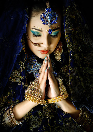
My Share.

Prarthana by Reymond Padriga, on FlickrLast edited by Emzs; 11-09-2010 at 05:18 AM.
-
11-09-2010, 06:27 AM #30
Advertisement
Similar Threads |
|


 Reply With Quote


